Ask most not-for-profit boards what branding means and you’ll usually get the same answer: a logo. Maybe a colour palette if they’re being thorough. It’s an understandable assumption, but it’s also one of the more costly misconceptions in the sector, because a logo is only ever the surface of something much bigger. For an organisation relying on donations, grants, volunteers and public trust to survive, branding isn’t decoration. It’s infrastructure.
A Logo Is a Symbol. A Brand Is a Case for Trust
A logo tells people what to look for. A brand tells them why they should care. For a not-for-profit, that distinction matters more than it does almost anywhere else in business, because the “sale” you’re making isn’t a transaction, it’s a decision to trust you with someone’s money, time, or reputation.
Donors want to know their contribution will be used well. Grant panels want to know your organisation is stable and capable of delivering on what it promises. Volunteers want to feel like they’re joining something credible and worth their energy. None of that confidence comes from a well-designed icon on its own. It comes from consistent, professional presentation across everything the organisation puts in front of people, from its website and social presence through to the documents it submits for funding.
Where the Gap Usually Shows Up
In practice, the branding gap in the NFP sector rarely comes from a lack of care. It comes from stretched resources. Logos get designed early, often on a shoestring budget, and everything that follows is built around them piecemeal, whenever there’s time or a volunteer with design skills available. The result, more often than not, is a patchwork: a slightly different logo file on the website than on the letterhead, inconsistent colours across social channels, and printed materials that look like they were produced by three different organisations rather than one.
Individually, none of these inconsistencies feel like a big deal. Together, they quietly undercut the professionalism an organisation is trying to project, right at the moments it matters most, such as when a grant application lands on a funding body’s desk alongside a dozen others.
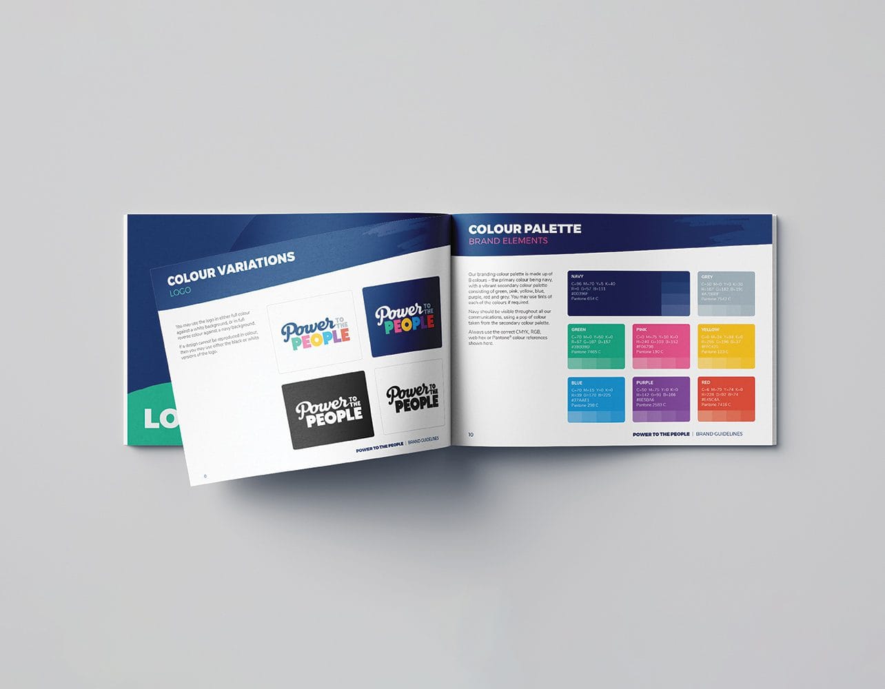
Professional, consistent branding builds the trust that drives donations, volunteers and funding.
Grant Applications Are a Branding Exercise Too
This is where the connection between branding and funding becomes very concrete. A grant application that looks polished, consistent and considered signals something to the assessor before they’ve even finished reading the first page: this organisation knows what it’s doing. A well-prepared grant or funding application, aligned with the rest of your brand, does real work in building that impression, the same way a strong capability statement does for a business chasing a tender.
The inverse is also true. A scattered, inconsistent presentation can raise quiet doubts about an organisation’s capacity to manage a project properly, regardless of how strong the actual program or cause is. In a competitive funding environment, that’s a disadvantage no not-for-profit can afford.
Consistency Builds Recognition, and Recognition Builds Support
There’s a compounding effect to strong branding that not-for-profits are especially well positioned to benefit from. Every touchpoint, whether it’s a fundraising flyer, an annual report, a social media post or a stall at a community event, is a chance to reinforce the same identity. Over time, that consistency builds recognition. People start to associate a particular look and tone with your cause, and that familiarity makes them more likely to engage, donate again, or mention you to someone else.
Annual reports are a particularly overlooked opportunity here. For many funders, board members and long-term donors, the annual report is the one document they’ll actually sit down and read in full each year. A well-designed annual report does more than satisfy a reporting obligation. It’s a chance to show impact clearly, reinforce the brand, and remind stakeholders why the organisation deserves continued support.
What Professional Branding Actually Involves
Getting this right doesn’t mean overhauling everything at once or spending money the organisation doesn’t have. It usually starts with a clear brand strategy: agreeing on what the organisation stands for, how it should sound, and how it should look, before any design work happens. From there, that strategy gets applied consistently, from logo and branding guidelines through to the templates used for everyday communications, so that every piece of collateral reinforces the same identity instead of working against it.
For most not-for-profits, this is less about a single big project and more about building a foundation that makes everything afterward easier and more consistent, whether that’s a new fundraising campaign, a grant submission, or simply updating the website.
Treating Brand as Part of the Mission, Not a Cost Against It
The organisations that get the most out of their cause tend to treat branding as part of how they deliver their mission, not as an expense competing against it. A strong, consistent identity doesn’t just look better. It builds the kind of trust that translates into donations, volunteers, partnerships and funding, which are the very things most not-for-profits are working hard to secure in the first place.
Let’s Talk About What a Proper Brand Foundation Could Do for You
If your organisation is relying on a logo from years ago and a collection of mismatched materials built up over time, it might be worth having a conversation about what a proper brand foundation could do for you. Feel free to get in touch and we can talk through what would make the biggest difference for your organisation.
Get in Touch